Case Study

ViHealth
Onboarding
and Booking

FemTech platform supporting women's mental health. I redesigned onboarding and booking flows to reduce anxiety and build trust at every step of the journey.

FemTech Mobile Startup UX Research Product Design
+90% Completion
-18% Bounce rate
64% A/B test uplift
ViHealth app

Company

ViHealth - FemTech, Netherlands
My role
Sole Product Designer
Industry
FemTech / Mental Health
Company stage
Early-stage startup
Scope
Research, design, testing

We weren't just losing conversions. We were losing confidence.

ViHealth connects women with qualified therapists through guided onboarding and session booking, often during moments of vulnerability, uncertainty and emotional stress.

New users felt overwhelmed during onboarding. The booking experience showed "available" sessions that didn't always reflect real therapist availability. In a health context, this disconnect matters — uncertainty becomes anxiety, and confusion becomes disengagement.

To understand what was really happening, I led a mixed-method research process combining surveys, interviews, prototype testing and behavioural data.

Key insight 1

Users don't prioritise speed — they prioritise trust, clarity and human connection. Who they're seeing matters more than how fast they can book.

Key insight 2

Onboarding steps weren't clearly defined, and clinical language made the experience feel impersonal and intimidating, increasing drop-off before users completed a single task.

Key insight 3

Messaging across ads, social posts and the app itself was misaligned — user expectations didn't match what they found when signing up.

+90%
Onboarding completion
Users completing the full onboarding flow after redesign
-18%
Bounce rate
Reduction in users leaving before completing key actions
64%
A/B test uplift
Improvement validated through structured experimentation

Two missions emerged

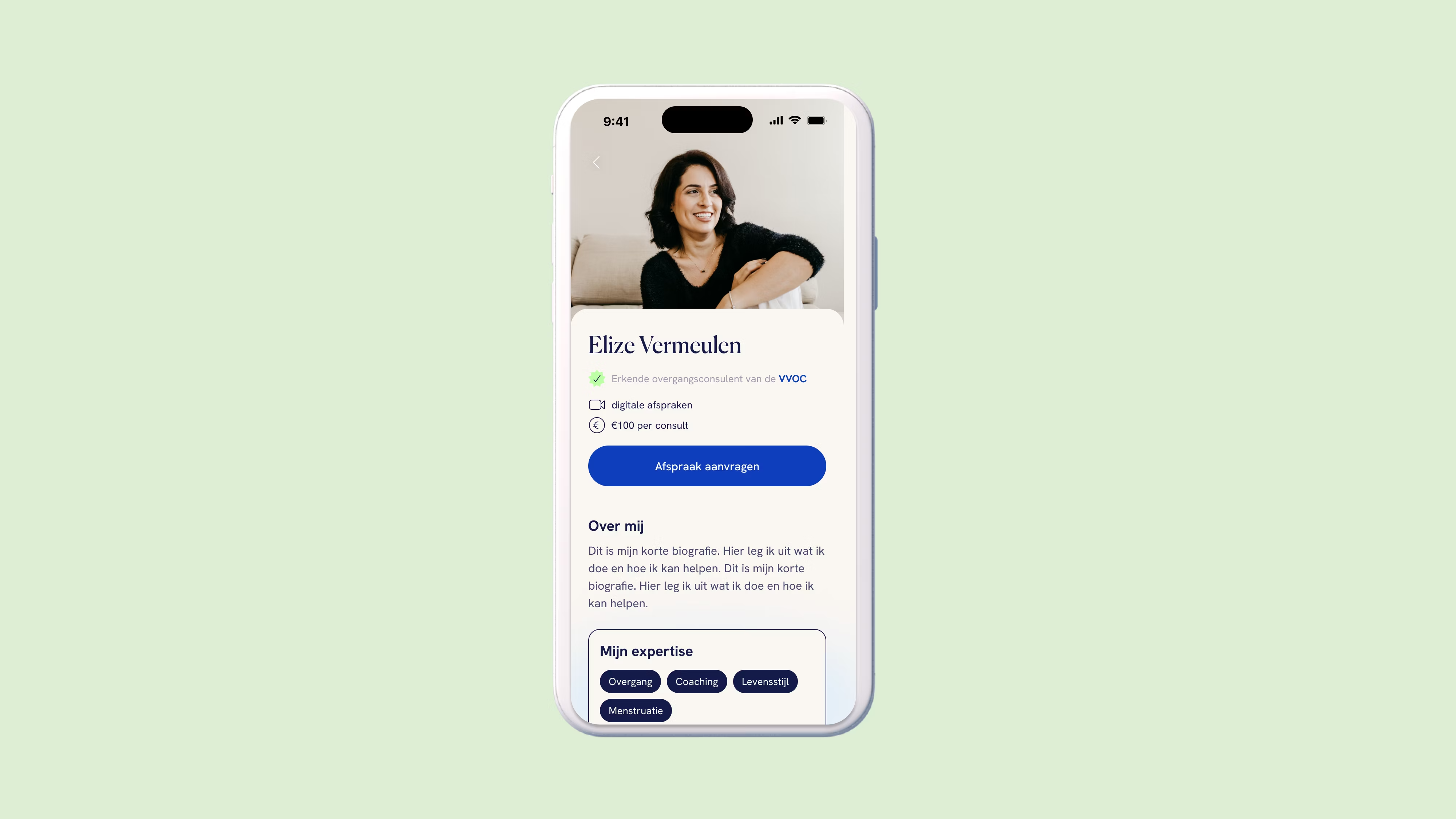
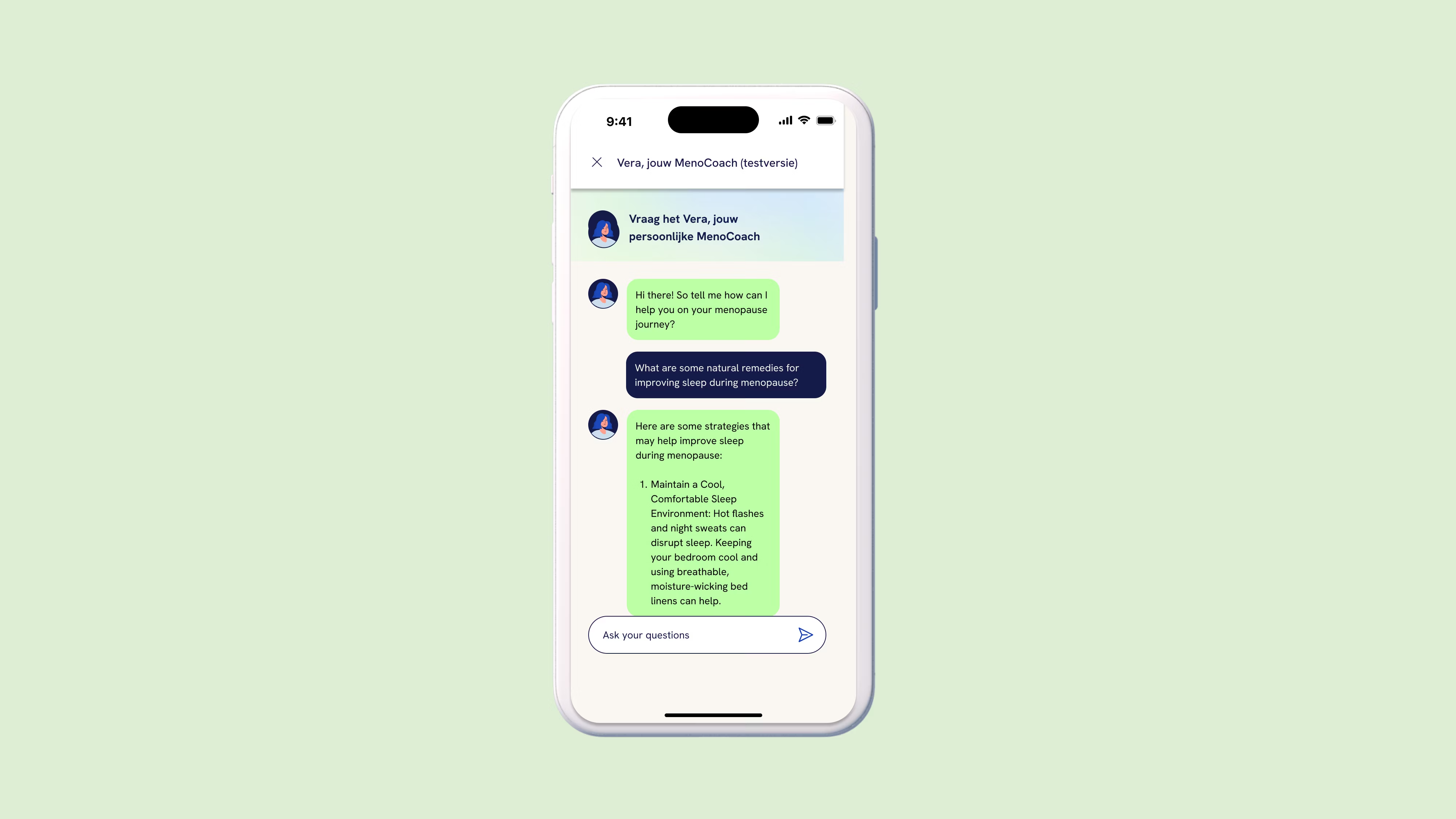
Through surveys, interviews, prototype testing and behavioural data analysis, a clear picture emerged: users value who they see over how fast they book. Consistency across touchpoints reduces confusion. Guidance and reassurance matter more than efficiency.

From this, two focused design missions took shape — each targeting a distinct point of failure in the product experience.

User interviews Surveys Prototype testing Behavioural data Journey mapping Stakeholder workshops
ViHealth app
Design solutions

Two assignments, one vision

01

Booking Experience Redesign

Turning an unreliable flow into a reassuring one.

The problem

Users weren't struggling with the interface itself — they were uncertain about their choices. They cared more about who they were seeing than how quickly they could book. Without reassurance, even simple steps caused doubt and frustration.

The solution

I redesigned the flow so users choose their therapist first, then select a time. This puts control in the user's hands and ensures availability matches expectations. Clear messaging and visual cues guide each step, creating an experience that feels human rather than transactional.

-18% Bounce rate
64% A/B test uplift
02

Onboarding Flow Redesign

Replacing overwhelm with guidance and clarity.

The problem

New users often felt overwhelmed and unsure where to start. Onboarding steps weren't clearly defined, and clinical language made the experience feel impersonal and even intimidating — creating anxiety and increasing drop-off before users completed their first task.

The solution

I redesigned the onboarding flow to feel guided and approachable. Steps were broken into a clear progressive sequence with visual progress indicators, and language was simplified to feel warmer and more human. Messaging was aligned across ads, social posts and the app itself.

+90% Onboarding completion
Design screens

From anxiety to confidence

Key screens from the redesigned onboarding and booking flows.

Onboarding screen 1
Onboarding / Step 1
Onboarding screen 2
Onboarding / Step 2
Booking screen
Booking / Therapist select
Booking confirmation
Booking / Confirmation
Profile screen
Therapist profile
Session screen
Session management
Strategic reflection

What I learned and what comes next

Key insights

Reliability matters more than polish. Users tolerate rough visuals; they won't tolerate broken promises about availability.

Consistency reduces cognitive load. Aligning messaging across channels removed a hidden source of user confusion.

Journeys start before the app. The user experience begins when a woman first notices symptoms, not when she downloads the product.

Confidence must be designed in. Every step needs to actively reduce uncertainty, not just avoid adding to it.

Future recommendations

Design the end-to-end journey. Extend the experience to guide users from symptom onset, not just app download.

Deepen B2B partnerships. Collaborate with HR and employers to deliver support at the right moment, creating measurable workplace impact.

Focus on perimenopausal users. Lean into the brand's credibility by providing personalised, workplace-driven guidance that differentiates from generic tracking apps.

See more of my work

Browse the full portfolio or get in touch to discuss how I can bring this kind of thinking to your team.